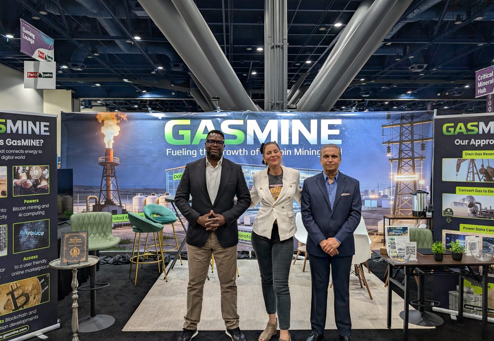
GasMINE NAPE Event 2026
The market was saturated with over-designed packaging relying heavily on imagery. The client needed a design that stood out with simplicity while reflecting a strong, confident brand voice.
Overview
We focused on making typography the central design element—clean, bold, and unapologetically simple. By using type as the brand's visual identity, we created a look that was instantly noticeable and memorable.
What we did:
Chose strong, distinctive typefaces to match the brand’s tone.
Used scale, spacing, and alignment to create dynamic layouts.
Kept the color palette minimal to let the typography shine.
Created hierarchy using font weights and contrast for quick scanning.


